
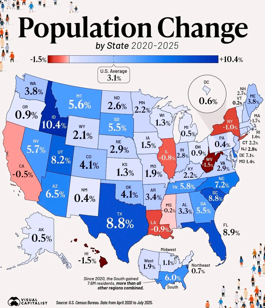
@savageupdatesBro just dropped population change by state 2020-2025 data across the us
Vedi post originale@savageupdatesBro just dropped population change by state 2020-2025 data across the us
Vedi post originaleFoto di @savageupdates· Sep 3, 2026· United States
The image is an infographic displaying population change by state in the US from 2020 to 2025. States are colored red for population decrease and blue for population increase, with percentages shown for each state. A color bar at the top indicates the range from -1.5% to +10.4%. The U.S. average population change is noted as 3.1%. A text box at the bottom states that since 2020, the South gained 7.6 million residents, more than all other regions combined. The bottom left corner features a "VISUAL CAPITALIST" logo. The overall style is informative and data-driven.
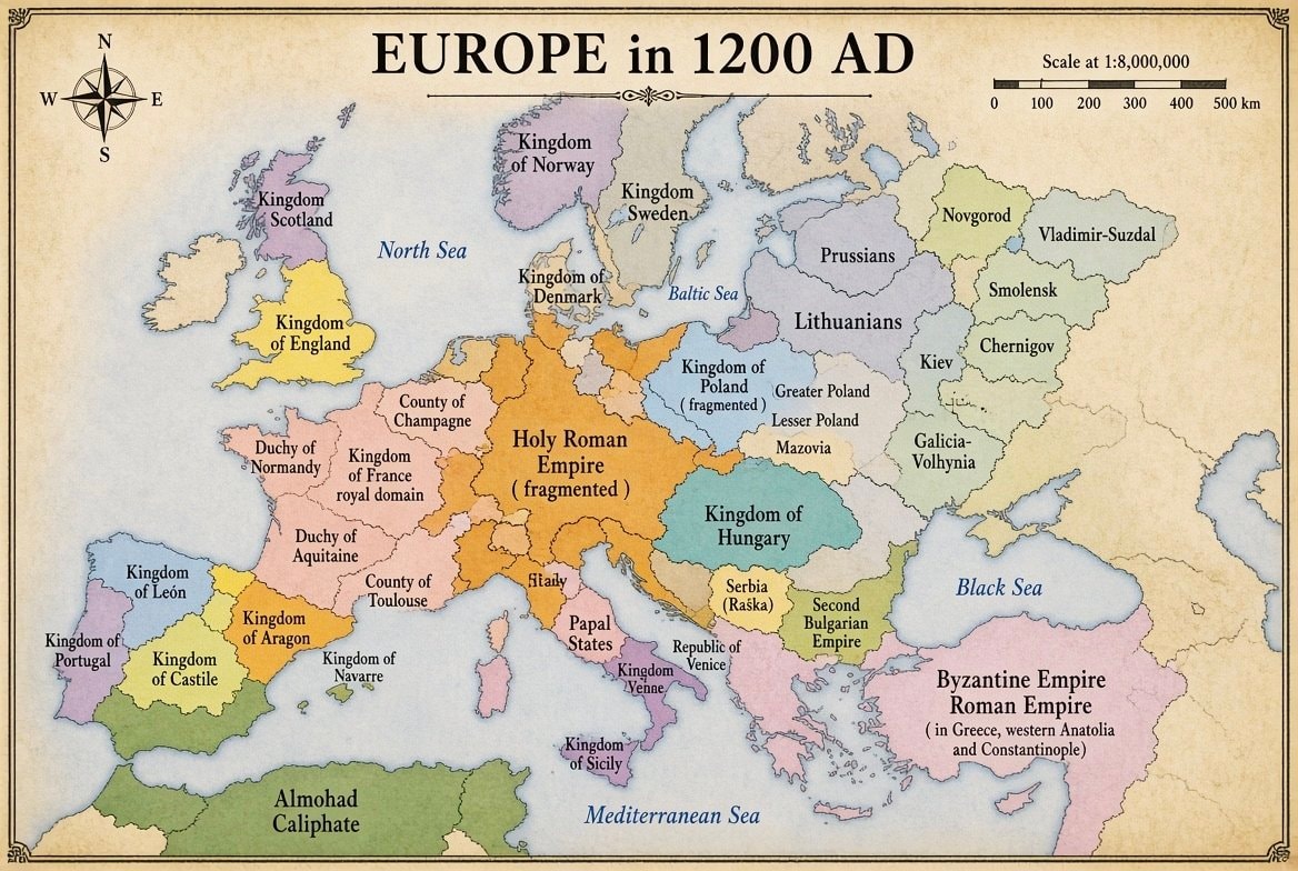 Europe in 1200 AD
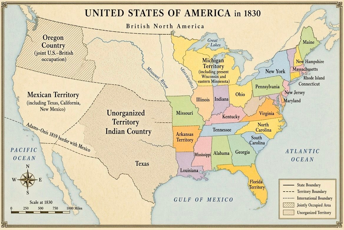 United States map 1830
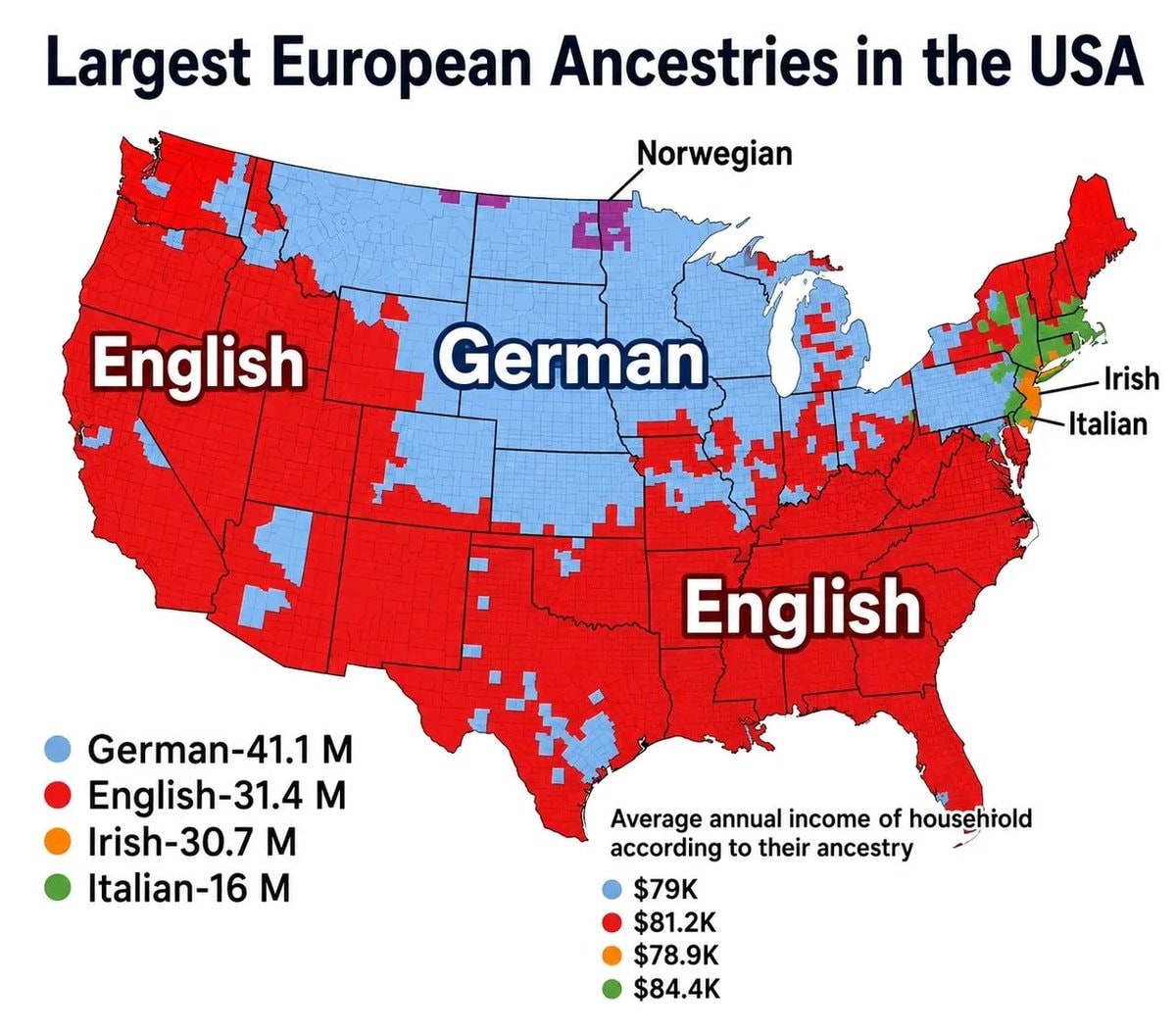 European ancestries map of the USA
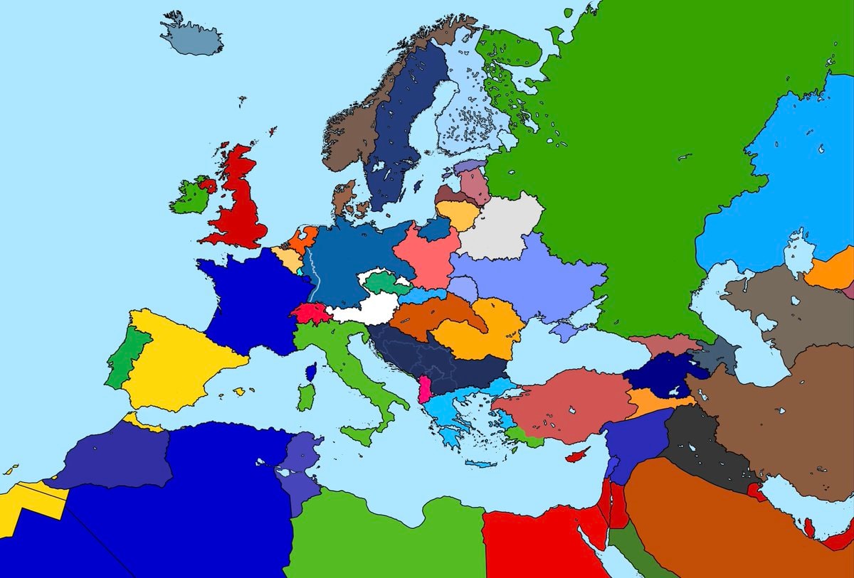 Alternate map of Europe after world war one
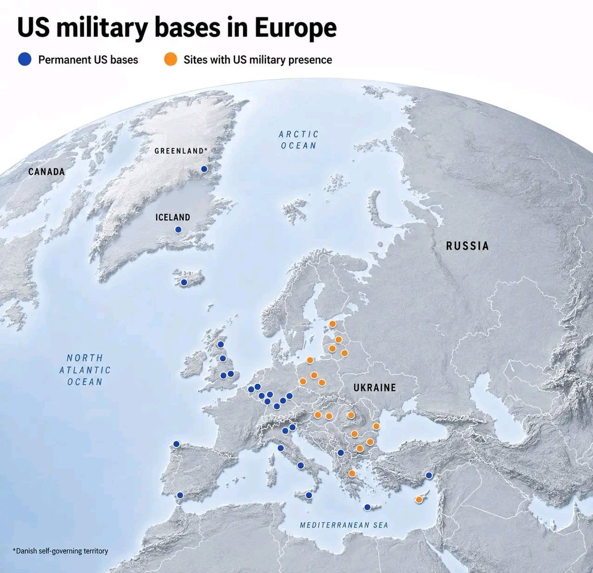 US Military bases in Europe
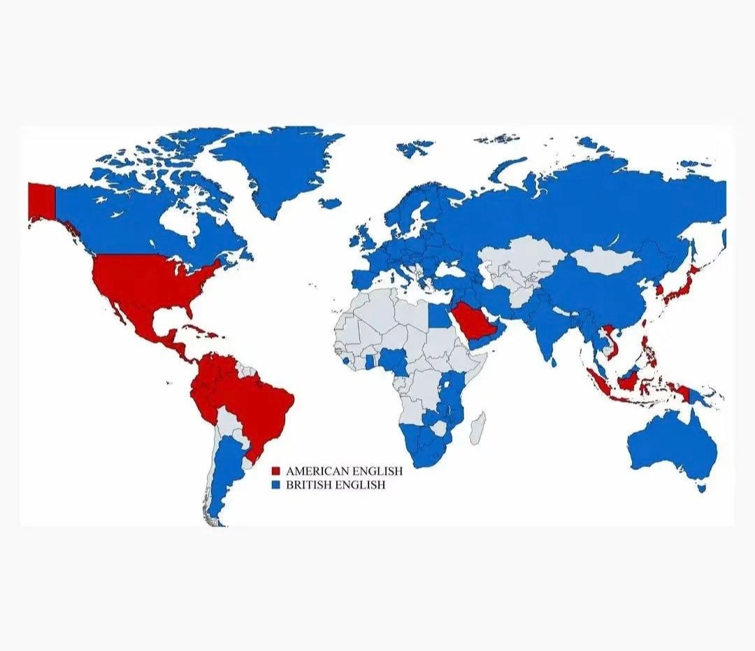 British vs American English school teaching
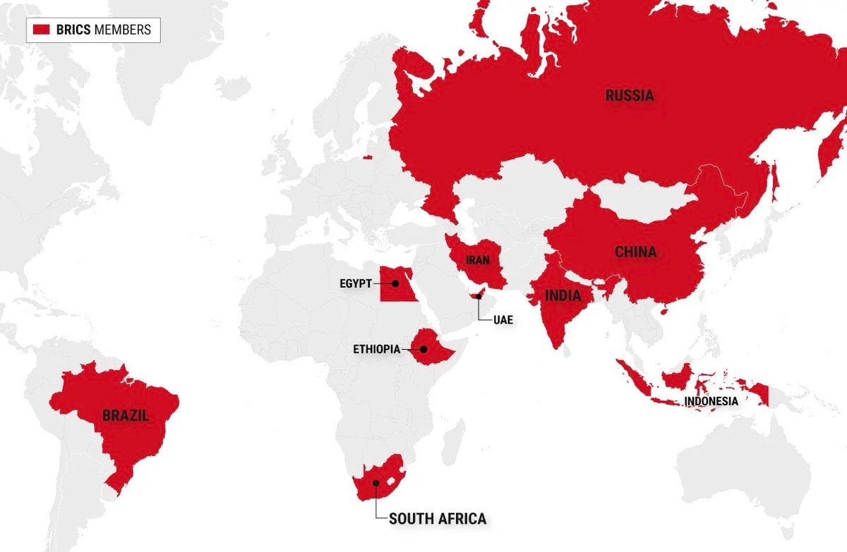 BRICS member countries map
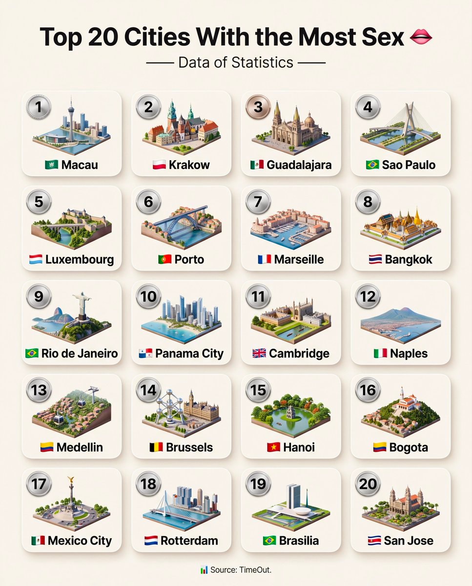 Top 20 Cities With the Most Sex
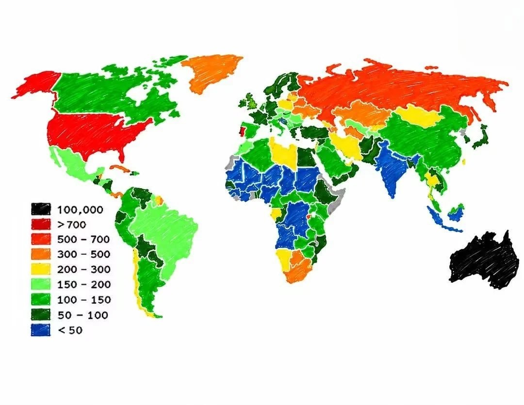 Prison population per 100,000 people
 Top 25 Best Beaches in the World 2026
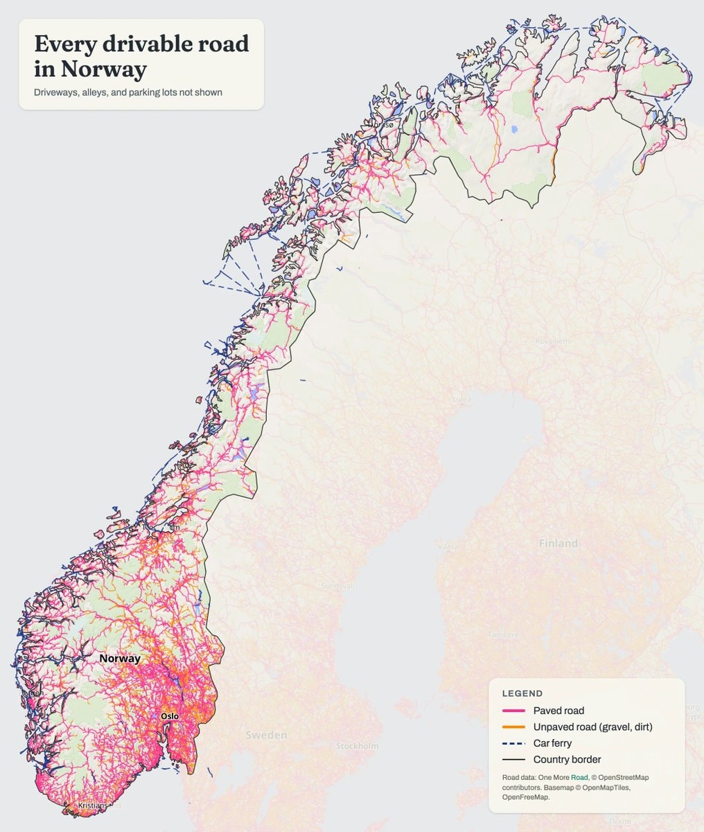 Norway drivable roads map
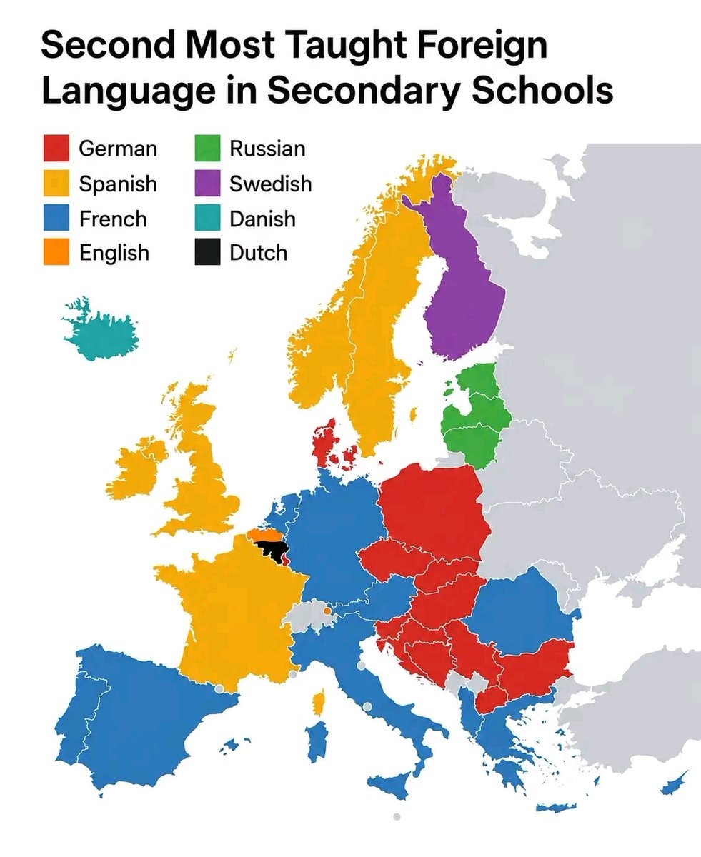 Second Most Taught Foreign Language in Secondary School
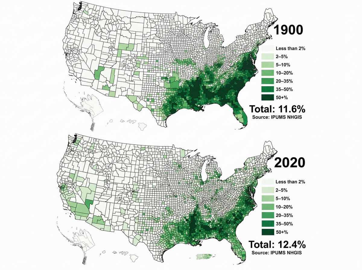 Black Population US 1900 vs 2020
 33 Things That Didn't Exist 25 Years Ago
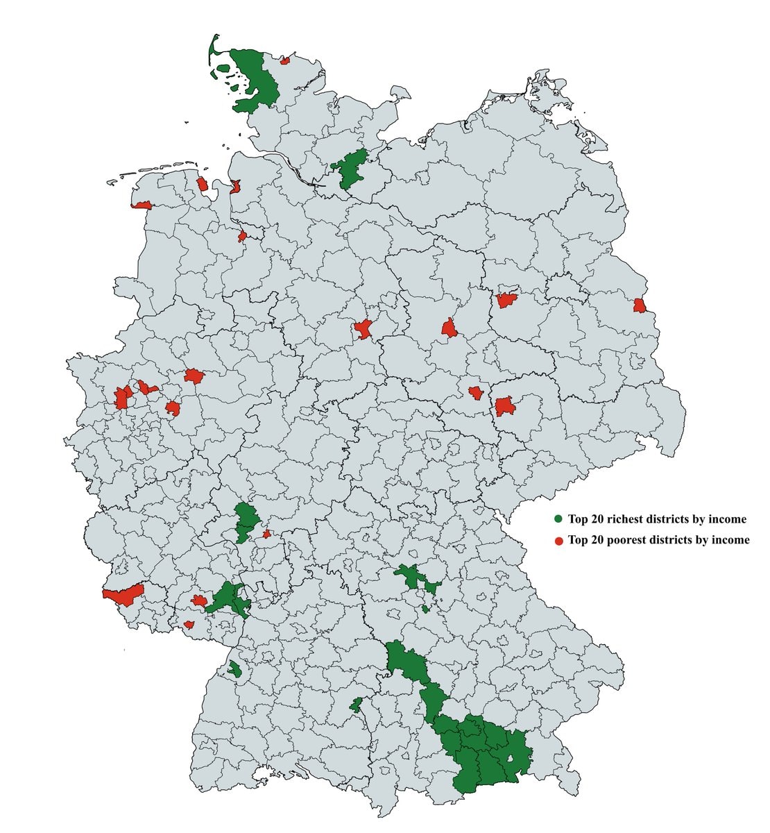 richest and poorest areas in Germany
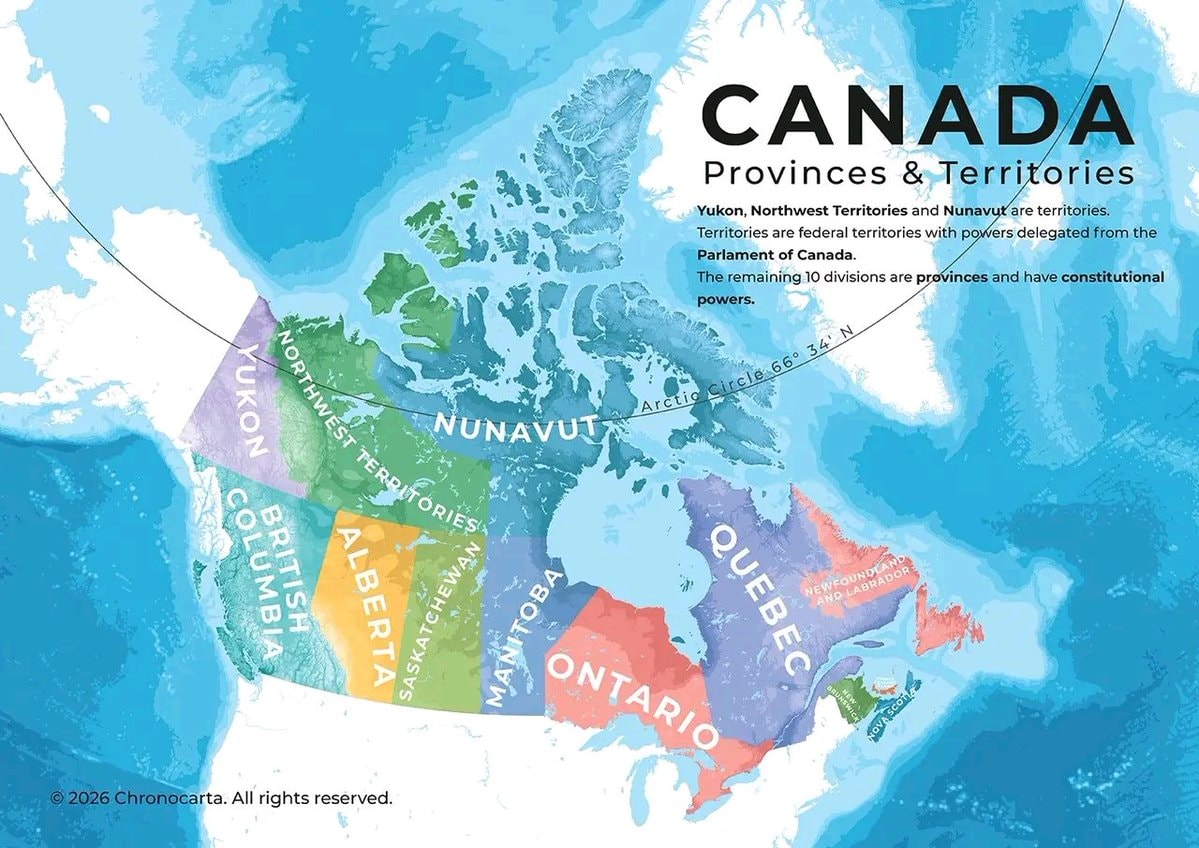 Canada provinces and territories map
 20 Women With the Longest Hair
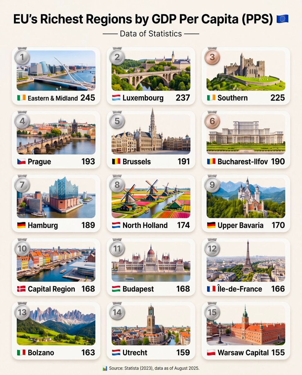 EU Richest Regions GDP Per Capita Ranking
@savageupdatesBro just dropped population change by state 2020-2025 data across the us
Vedi post originaleFoto di @savageupdates· Sep 3, 2026· United States
The image is an infographic displaying population change by state in the US from 2020 to 2025. States are colored red for population decrease and blue for population increase, with percentages shown for each state. A color bar at the top indicates the range from -1.5% to +10.4%. The U.S. average population change is noted as 3.1%. A text box at the bottom states that since 2020, the South gained 7.6 million residents, more than all other regions combined. The bottom left corner features a "VISUAL CAPITALIST" logo. The overall style is informative and data-driven.
Ancora nessun commento. Sii il primo!
Europe in 1200 ADUnited States map 1830European ancestries map of the USAAlternate map of Europe after world war oneUS Military bases in EuropeBritish vs American English school teachingBRICS member countries mapTop 20 Cities With the Most SexPrison population per 100,000 peopleTop 25 Best Beaches in the World 2026Norway drivable roads mapSecond Most Taught Foreign Language in Secondary SchoolBlack Population US 1900 vs 202033 Things That Didn't Exist 25 Years Agorichest and poorest areas in GermanyCanada provinces and territories map20 Women With the Longest HairEU Richest Regions GDP Per Capita Ranking
Ancora nessun commento. Sii il primo!