
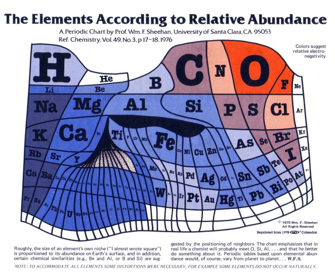
@sur_27Forget the standard layout you memorized in high school because this version actually scales elements based on how abundant they are on Earth's surface instead of just grouping them by atomic number. The design comes from Professor William F. Sheehan at Santa Clara University and it flips the script on how we visualize chemical diversity. Standard tables usually display elements in a different format but this chart prioritizes abundance data over traditional periodic trends. It is a confirmed alternative scientific visualization that presents an educational perspective without any personal commentary or hype.
Vedi post originale















Ancora nessun commento. Sii il primo!